문서 흐름(Document Flow)이란?
HTML 요소는 기본적으로 문서 흐름에 따라 배치됩니다. 이는 다음과 같은 규칙을 따릅니다.
-블록 요소(Block Elenents): 한 줄을 모두 차지하며, 수직으로 쌓입니다.(예 : <div>,<p>,<h1>).
-인라인 요소(lnline Elements): 한 줄에 나란히 배치되며, 줄 바꿈 없이 옆으로 이어집니다.(예:<span>,<a>,<strong>).
-기본 흐름: 요소는 HTML에 작성된 순서대로 위에서 아래로 (블록 요소) 또는 왼쪽에서 오른쪽으로(인라인 요소)배치됩니다.

<!DOCTYPE html>
<html lang="ko">
<head>
  <meta charset="UTF-8">
  <title>문서 흐름 이해하기</title>
  <style>
    body {
      font-family: Arial, sans-serif;
      padding: 20px;
    }
    .block {
      background-color: #ffccbc;
      border: 2px solid #333;
      padding: 10px;
      margin-bottom: 10px;
    }
    .inline {
      background-color: #c8e6c9;
      border: 2px solid #333;
      padding: 5px;
    }
  </style>
</head>
<body>
  <h2>문서 흐름 이해하기</h2>

  <h3>1. 블록 요소 (수직으로 쌓임)</h3>
  <div class="block">블록 요소 1</div>
  <div class="block">블록 요소 2</div>
  <div class="block">블록 요소 3</div>

  <h3>2. 인라인 요소 (수평으로 나란히)</h3>
  <span class="inline">인라인 요소 1</span>
  <span class="inline">인라인 요소 2</span>
  <span class="inline">인라인 요소 3</span>
</body>
</html>
position( 위치 지정 )
설명 : position 속성은 요소의 위치를 어떻게 배치할지 설정합니다. HTML 요소는 기본적으로 문서 흐름에 따라 배치되지만
position을 사용하면 이를 변경할 수 있습니다.
값:
- static : 기본값, 문서 흐름에 따라 배치(기본 위치).
- relative: 문서 흐름에 따라 배치되지만 , top,left,right,bottom으로 원래 위치에서 상대적으로 이동,
- absolute: 문서 흐름에서 벗어나며, 가장 가까운 position이 relative/absolute/fixed인 부모 요소를 기준으로 top, left, righte,
bottom으로 이동(스크롤해도 고정됨).
주의사항 : relative, absolute, fixed를 사용할 때는 top, left, right, bottom 속성을 함께 설정해야 위치를 조정할 수 있습니다.
|뼈대 코드
<!DOCTYPE html>
<html lang="ko">
<head>
  <meta charset="UTF-8">
  <title>우주 탐험 배경</title>

</head>
<body>
  <div class="star" style="top: 50px; left: 100px;">✨</div>
  <div class="star" style="top: 150px; left: 300px;">✨</div>
  <div class="star" style="top: 300px; left: 150px;">✨</div>
  <div class="star" style="top: 1200px; left: 450px;">✨</div>
  <div class="planet"></div>
  <div class="spaceship">🚀</div>
</body>
</html>
<!DOCTYPE html>
<html lang="ko">
<head>
  <meta charset="UTF-8">
  <title>우주 탐험 배경</title>
  <style>

    body {
        background-color: black;
        margin: 0;
        height: 100vh;
        /* static(기본값, 문서에 흐름)*/
        position: static;
    }

    .star {
        /* position: static; */
        /* position: static; (기본값 일 때 top,left,right, bottom 속성이 적용 안됨) */
        position: absolute;
        font-size: 20px;
    }
    .planet {
        width: 80px;
        height: 80px;
        background-color: yellow;
        border-radius: 50%;
        position: absolute;
        top: 100px;
        left: 200px;
    }

    .spaceship {
        /* fixed: 문서 흐름에서 벗어나며, 뷰포트(화면)를 기준으로 top, left,
         right, bottom으로 이동(스크롤해도 고정됨) */
        position: fixed; /* 화면 기준 고정 */
        top: 50px;
        right: 50px;
        font-size: 40px;
        z-index: 3; /* 가장 위 */
    }

  </style>

</head>
<body>
  <div class="star" style="top: 50px; left: 100px;">✨</div>
  <div class="star" style="top: 150px; left: 300px;">✨</div>
  <div class="star" style="top: 300px; left: 150px;">✨</div>
  <div class="star" style="top: 1200px; left: 450px;">✨</div>
  <div class="planet"></div>
  <div class="spaceship">🚀</div>
</body>
</html>
| 내 코드
<!DOCTYPE html>
<html lang="en">
  <head>
    <meta charset="UTF-8" />
    <meta name="viewport" content="width=device-width, initial-scale=1.0" />
    <title>우주 탐험</title>
    <style>
      body {
        background-color: black;
        margin: 0;
        padding: 0;
        /* static(기본값, 문서에 흐름 - block ,inline) */
        position: static;
      }
      @keyframes star {
        0% {
          transform: translate(0, 0);
          opacity: 1;
        }
        85% {
          transform: translate(-100px, 100px);
          opacity: 1;
        }
        95% {
          opacity: 0; /* 사라졌다가 */
        }
        100% {
          transform: translate(0, 0);
          opacity: 1; /* 바로 시작 위치로 돌아오며 다시 나타남 */
        }
      }

      .star {
        position: absolute;
        font-size: 30px;
        animation: star 3s ease-in-out infinite;
      }
      .planet {
        width: 100px;
        height: 100px;
        font-size: 150px;
        position: absolute;
        top: 100px;
        left: 200px;
      }

      .spaceship {
        /* fixed - 문서의 흐름에서 벗어나면 화면 기준으로 top,left,right,bottom으로
            지정 가능  스크롤을 움직여도 화면 기준으로 고정이 된다*/
        position: fixed;
        top: 300px;
        right: 500px;
        font-size: 40px;
        z-index: 1000;
      }
    </style>
  </head>
  <body>
    <div class="star" style="top: 50px; left: 100px">☄️</div>
    <div class="star" style="top: 450px; left: 350px">🌠</div>
    <div class="star" style="top: 300px; left: 150px">☄️</div>
    <div class="star" style="top: 1200px; left: 450px">🌠</div>
    <div class="star" style="top: 100px; left: 250px">🌠</div>
    <div class="star" style="top: 230px; left: 350px">☄️</div>
    <div class="star" style="top: 540px; left: 350px">🌠</div>
    <div class="star" style="top: 700px; left: 350px">🌠</div>
    <div class="star" style="top: 760px; left: 250px">☄️</div>
    <div class="star" style="top: 800px; left: 550px">🌠</div>
    <div class="star" style="top: 100px; left: 650px">☄️</div>
    <div class="star" style="top: 130px; left: 750px">🌠</div>
    <div class="star" style="top: 260px; left: 550px">☄️</div>
    <div class="star" style="top: 300px; left: 950px">🌠</div>
    <div class="star" style="top: 3900px; left: 1000px">☄️</div>
    <div class="star" style="top: 100px; left: 800px">🌠</div>
    <div class="planet">🌕</div>
    <div class="spaceship">🚀</div>
  </body>
</html>
|실습 예제 2
|overflow 확인해 보기

뼈대 코드
<!DOCTYPE html>
<html lang="ko">
<head>
  <meta charset="UTF-8">
  <title>스크롤 가능한 메시지 박스</title>

</head>
<body>
  <h2>스크롤 가능한 메시지 박스</h2>

  <h3>1. overflow: hidden (넘치는 부분 숨김)</h3>
  <div class="message-box box-hidden">
    안녕하세요! 이 메시지는 아주 길어서 박스를 넘치게 됩니다. 넘치는 부분은 숨겨집니다.
    더 많은 텍스트가 있지만 보이지 않을 거예요. 계속해서 더 길게 작성해 볼게요.
    정말 정말 긴 메시지입니다. 끝까지 읽어보세요!
    안녕하세요! 이 메시지는 아주 길어서 박스를 넘치게 됩니다. 넘치는 부분은 숨겨집니다.
    더 많은 텍스트가 있지만 보이지 않을 거예요. 계속해서 더 길게 작성해 볼게요.
    정말 정말 긴 메시지입니다. 끝까지 읽어보세요!
  </div>

  <h3>2. overflow: scroll (항상 스크롤바 표시)</h3>
  <div class="message-box box-scroll">
    안녕하세요! 이 메시지는 아주 길어서 박스를 넘치게 됩니다. 스크롤바가 항상 표시됩니다.
    더 많은 텍스트가 있지만 스크롤로 볼 수 있어요. 계속해서 더 길게 작성해 볼게요.
    정말 정말 긴 메시지입니다. 끝까지 읽어보세요!
  </div>

  <h3>3. overflow: auto (넘칠 때만 스크롤바 표시)</h3>
  <div class="message-box box-auto">
    안녕하세요! 이 메시지는 아주 길어서 박스를 넘치게 됩니다. 넘칠 때만 스크롤바가 표시됩니다.
    더 많은 텍스트가 있지만 스크롤로 볼 수 있어요. 계속해서 더 길게 작성해 볼게요.
    정말 정말 긴 메시지입니다. 끝까지 읽어보세요!
  </div>
</body>
</html>
<!DOCTYPE html>
<html lang="ko">
<head>
  <meta charset="UTF-8">
  <title>스크롤 가능한 메시지 박스</title>
  <style>
    body {
      padding: 40px;
      font-family: Arial, sans-serif;
    }
    .message-box {
      width: 300px;
      height: 150px;
      border: 2px solid #333;
      padding: 10px;
      margin-bottom: 20px;
      background-color: #f0f0f0;
    }
    .box-hidden {
      overflow: hidden; /* 넘치는 부분 숨김 */
    }
    .box-scroll {
      overflow: scroll; /* 항상 스크롤바 표시 */
    }
    .box-auto {
      overflow: auto; /* 넘칠 때만 스크롤바 표시 */
    }
  </style>
</head>
<body>
  <h2>스크롤 가능한 메시지 박스</h2>

  <h3>1. overflow: hidden (넘치는 부분 숨김)</h3>
  <div class="message-box box-hidden">
    안녕하세요! 이 메시지는 아주 길어서 박스를 넘치게 됩니다. 넘치는 부분은 숨겨집니다.
    더 많은 텍스트가 있지만 보이지 않을 거예요. 계속해서 더 길게 작성해 볼게요.
    정말 정말 긴 메시지입니다. 끝까지 읽어보세요!
    안녕하세요! 이 메시지는 아주 길어서 박스를 넘치게 됩니다. 넘치는 부분은 숨겨집니다.
    더 많은 텍스트가 있지만 보이지 않을 거예요. 계속해서 더 길게 작성해 볼게요.
    정말 정말 긴 메시지입니다. 끝까지 읽어보세요!
  </div>

  <h3>2. overflow: scroll (항상 스크롤바 표시)</h3>
  <div class="message-box box-scroll">
    안녕하세요! 이 메시지는 아주 길어서 박스를 넘치게 됩니다. 스크롤바가 항상 표시됩니다.
    더 많은 텍스트가 있지만 스크롤로 볼 수 있어요. 계속해서 더 길게 작성해 볼게요.
    정말 정말 긴 메시지입니다. 끝까지 읽어보세요!
  </div>

  <h3>3. overflow: auto (넘칠 때만 스크롤바 표시)</h3>
  <div class="message-box box-auto">
    안녕하세요! 이 메시지는 아주 길어서 박스를 넘치게 됩니다. 넘칠 때만 스크롤바가 표시됩니다.
    더 많은 텍스트가 있지만 스크롤로 볼 수 있어요. 계속해서 더 길게 작성해 볼게요.
    정말 정말 긴 메시지입니다. 끝까지 읽어보세요!
  </div>
</body>
</html>
|실습 예제3
|position: static, realtive, z-index 사용해보기
뼈대 코드
<!DOCTYPE html>
<html lang="ko">
<head>
  <meta charset="UTF-8">
  <title>포토 갤러리</title>

</head>
<body>
  <h2>나만의 포토 갤러리</h2>
  <div class="gallery">
    <div class="photo-card card1">사진 1</div>
    <div class="photo-card card2">사진 2</div>
    <div class="photo-card card3">사진 3</div>
    <div class="photo-card card4">사진 4</div>
  </div>
</body>
</html>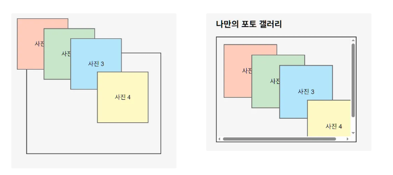
문제 원인: gallery의 position:static 때문에 .photo-card가 .gallery를 기준으로 위치를 설정하지 않고, <body>를 기준으로 배치되었습니다. 이로 인해 gallery의 overflow:auto가 동작하지 않았습니다.
해결 방법: gallery의 position을 relative로 설정하여 .photo-card가 .gallery를 기준으로 위치를 설정하도록 했습니다.
핵심 포인트: position:absolute를 사용할 때는 기준점이 되는 부모 요소에 position: relative를 설정하는 것이 일반적입니다.
<!DOCTYPE html>
<html lang="ko">
<head>
  <meta charset="UTF-8">
  <title>포토 갤러리</title>
  <style>
    body {
      background-color: #f5f5f5;
      padding: 40px;
      font-family: Arial, sans-serif;
      position: static;
    }
    .gallery {
      width: 400px;
      height: 300px;
      border: 2px solid #333;
      /* position: static; */
      position: relative;
      overflow: auto; /* 넘치는 내용 스크롤 처리 */
    }
    .photo-card {
      width: 150px;
      height: 150px;
      position: absolute;
      border: 2px solid #666;
      background-color: #fff;
      text-align: center;
      line-height: 150px;
      font-size: 18px;
    }
    .card1 {
      top: 20px;
      left: 20px;
      z-index: 1;
      background-color: #ffccbc;
    }
    .card2 {
      top: 50px;
      left: 100px;
      z-index: 2;
      background-color: #c8e6c9;
    }
    .card3 {
      top: 80px;
      left: 180px;
      z-index: 3;
      background-color: #b3e5fc;
    }
    .card4 {
      top: 180px;
      left: 260px;
      z-index: 4;
      background-color: #fff9c4;
    }
  </style>
</head>
<body>
  <h2>나만의 포토 갤러리</h2>
  <div class="gallery">
    <div class="photo-card card1">사진 1</div>
    <div class="photo-card card2">사진 2</div>
    <div class="photo-card card3">사진 3</div>
    <div class="photo-card card4">사진 4</div>
  </div>
</body>
</html>
'HTML CSS' 카테고리의 다른 글
| CSS 우선순위와 상속 - 22 (0) | 2025.06.07 |
|---|---|
| CSS Float와 Clear 속성 - 19 (0) | 2025.06.06 |
| CSS font 속성 - 16 (3) | 2025.06.04 |
| CSS block, inline 에 대해 알아 보자 - 15 (0) | 2025.06.03 |
| CSS background 에 이해 - 14 (0) | 2025.05.31 |